LeagueNews.co | Jason Patrick
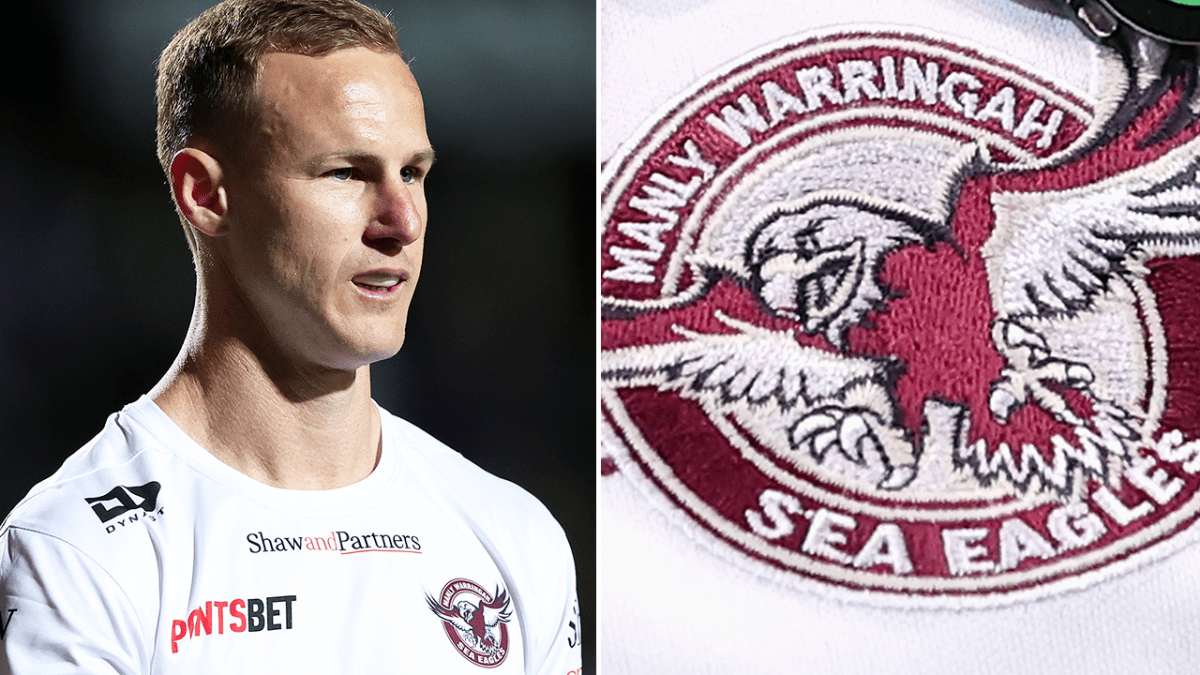
The Manly Sea Eagles have stunned fans with their radical new emblem reveal, marking a significant departure from their traditional design.
The emblem, featuring an aggressive-looking eagle's head, symbolizes the club's ambition and determination to embrace the future.
Manly CEO Tony Mestrov describes the change as a way to modernize the club and showcase their forward-thinking approach.
The decision to update the emblem was made in consultation with various stakeholders, including members' council, fans, players, and sponsors.
Mestrov expresses his gratitude for the overwhelming support received during the process.
The new emblem draws inspiration from the club's rich legacy while representing its resilience.
The timing of the emblem change is particularly significant as Manly prepares to make history by playing the first premiership game in the United States in 2024.
This bold move aligns with the club's ambition to expand its reach and make a mark on the international stage.
The previous emblem, featuring a sea eagle with wings spread wide, had been in use since the club's establishment in 1947.
The decision to replace it reflects Manly's desire to showcase their progressive mindset and adapt to the demands of the modern era.
Overall, the new emblem represents a significant milestone in the Manly Sea Eagles' history, symbolizing their determination to evolve and thrive in the 21st century.
